
Introduction
In The Woodlands, interior color choices are rarely "random." With tall pines, filtered daylight, and a natural-luxury home style, the most popular paint colors for 2026 lean warm, organic, and calm. Think grounded greens, softened neutrals, and earthy accents that feel timeless not trendy. Learn more about refreshing your interiors with Home Remodeling Services and explore professional color and design solutions through interior Remodeling Services for The Woodlands.
If you're refreshing one room or coordinating an entire home, start by planning how color connects with layout, lighting, finishes, and cabinetry. Many homeowners pair paint updates with wider upgrades like trim, built-ins, and lighting, especially in open layouts and daylight-driven interiors .
Below are the most requested interior paint directions for 2026 plus practical guidance on undertones, finishes, and room-by-room choices that look right in Woodlands light.
How Woodlands Light Affects Color Choice
Before picking any color, it helps to understand why paint looks different in The Woodlands compared to other Texas cities. The dense tree canopy filters sunlight throughout the day, producing a cooler, greener cast indoors—especially in rooms with north- or east-facing windows. This has real consequences for paint selection:
- Grays can read blue or green in rooms shaded by trees—this is why homeowners often feel a "cool" gray looks fine on the chip but strange on the wall.
- Warm neutrals look more balanced because the warm undertone counteracts the cool filtered light, producing a result closer to what you saw in the store.
- Saturated colors (greens, blues) deepen in lower-light rooms—what appears mid-tone in a paint store can look two shades darker in a shaded Woodlands room.
- South-facing rooms get more direct Texas sun and can handle slightly cooler or brighter tones without feeling cold.
The practical takeaway: always test a large paint swatch (at least 12"x12") on the actual wall and observe it at different times of day before committing. What looks right at noon may shift noticeably by late afternoon when exterior tree shadows deepen. If you're also improving how light moves through your home, see: maximizing natural light remodeling tips.
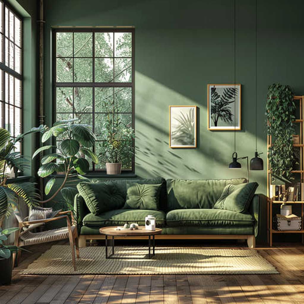
Forest Greens That Echo The Woodlands' Natural Beauty
Deep, forest-inspired greens are becoming a "core wall color" rather than just an accent. In The Woodlands, they feel especially natural because they echo the outdoors while still reading upscale and intentional indoors.
Where it works best: living rooms with large windows, moody dining spaces, and home offices. Forest greens also pair beautifully with natural oak, walnut tones, and textured stone—especially when you're mixing materials on purpose (see: how to use mixed materials to elevate your home).
Pro styling tip: If your home has custom built-ins or feature walls, a forest green backdrop makes millwork look more premium. If you're considering built-ins as part of your update, you'll like: best custom built-ins & cabinets in The Woodlands.
Undertone watch: Look for greens with brown or gray undertones rather than yellow—yellow-based greens can read lime-like under Woodlands' filtered daylight, which is rarely the effect homeowners are after.
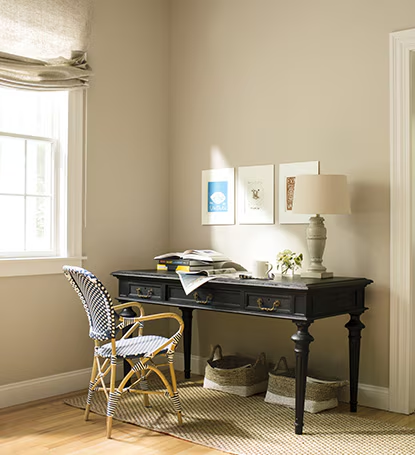
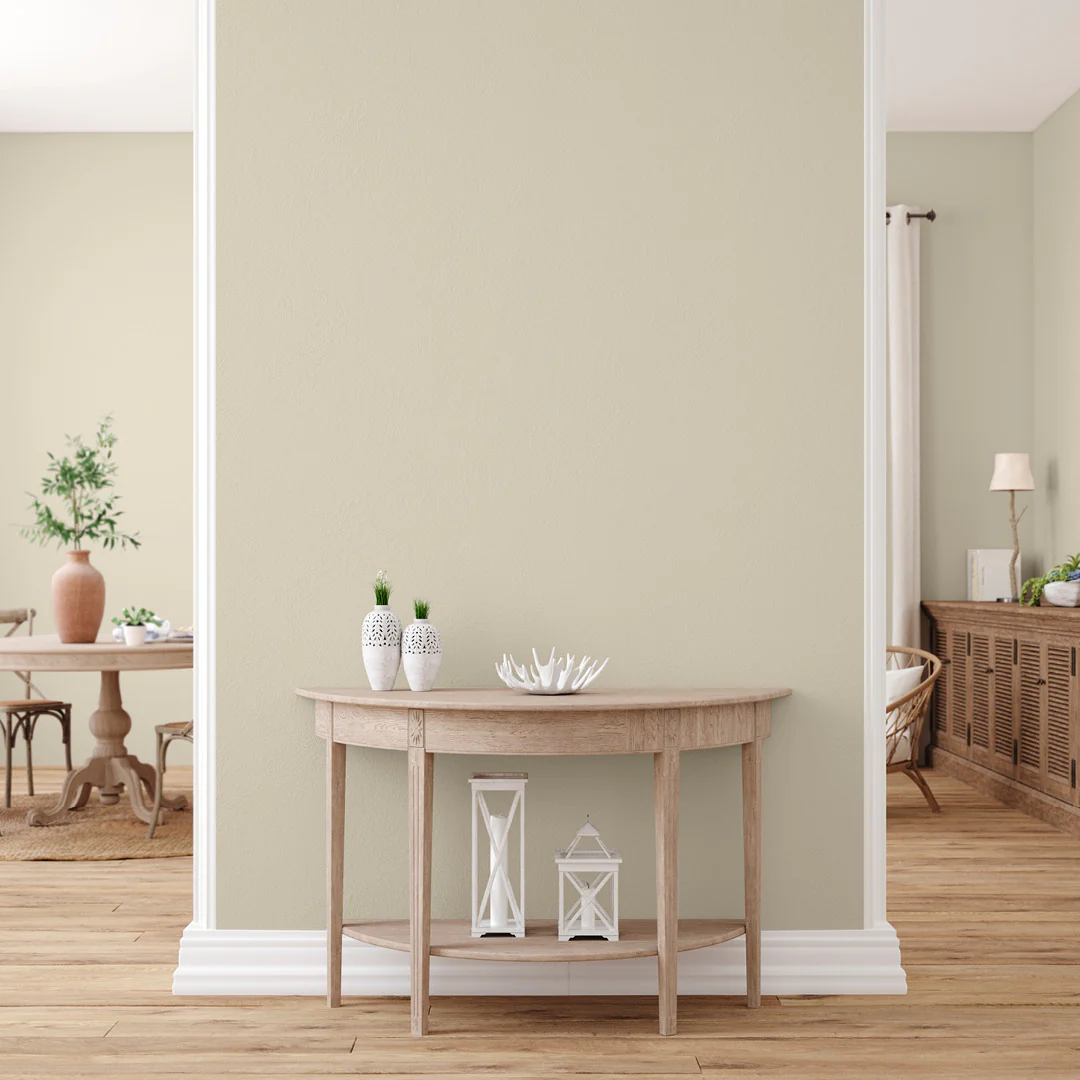
Warm Taupes and Greige Neutrals
Warm neutrals—taupe, greige, and soft mushroom—are the "safe luxury" choice for 2026. They're versatile, they don't fight with wood tones, and they look rich in both morning and evening light—key in Woodlands homes surrounded by trees.
These colors work exceptionally well in open layouts because they create continuity between kitchen, dining, and living spaces without feeling monotonous. If you're planning a paint refresh alongside flooring, lighting, or trim upgrades, it's often smartest to approach it as a cohesive interior update through interior remodeling services in The Woodlands, Texas.
Pairing tip: Warm neutrals look best when your trim white is also warm—avoid icy whites unless your finishes are very cool-toned. A white with a cream or linen base keeps the palette cohesive and prevents the walls from looking "dirty" by contrast.
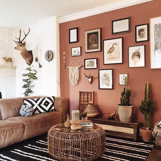
Soft Terracotta and Earthy Clay Hues
Terracotta is back—but in softer, clay-inspired versions that feel refined rather than loud. These tones add warmth quickly, making them a strong choice for accent walls, niches, powder rooms, and bedrooms.
Terracotta looks especially high-end when paired with natural textures: woven shades, limewash-like finishes, warm metals, and wood cabinetry. If you're updating a bathroom or vanity area, a clay accent paired with premium finishes can feel like a full upgrade (related read: bathroom remodel ideas that add value).
Practical note: In smaller rooms, choose "muted terracotta" (more beige/brown in the base) to avoid an orange cast under warm bulbs. Test the swatch at night under your actual lighting before committing—terracotta is one of the colors that shifts most dramatically between daylight and artificial light.
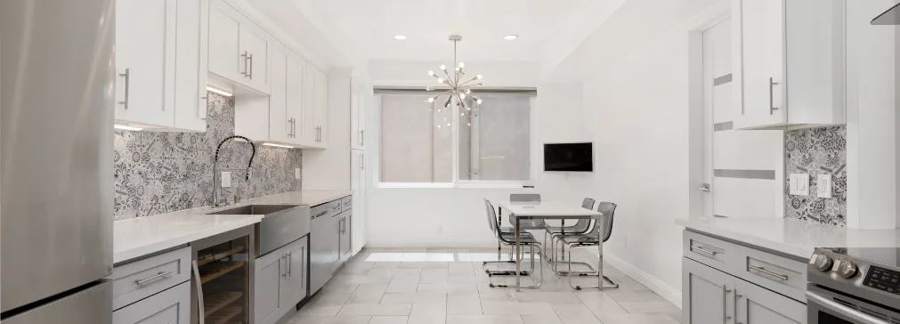
Calm Oatmeal and Organic Beige Palettes
Oatmeal, linen, and warm off-whites remain top choices for homeowners who want a bright home without the "stark white" look. These shades bring softness and depth—great for rooms with natural wood, stone, and warm-toned flooring.
They also make a perfect backdrop for statement cabinetry. If you're planning a kitchen update, pair your wall color decision with cabinetry planning (related reads: custom vs stock vs semi-custom cabinets and best custom kitchen cabinet makers in The Woodlands).
These shades also age better than pure whites—they don't show scuff marks or yellowing as prominently, which matters in high-traffic areas like hallways, kitchens, and family rooms.
Stone Gray With Warm Undertones
Gray isn't "gone", it's just warmer now. Stone grays with beige or clay undertones still feel clean and modern, but they won't make a space look cold or flat.
Where it works best: primary bedrooms, hallways, and bathrooms, especially when you want a calm, spa-like vibe. Pair it with brushed metals, warm lighting, and natural materials for balance.
If you're doing a bathroom refresh, your paint choice should match your surfaces and ventilation strategy too.
What to avoid: Pure cool grays (with blue or purple undertones) are the most common source of paint regret in Woodlands homes. Under filtered tree light, they can feel uncomfortably cold even in rooms that feel bright during the day.
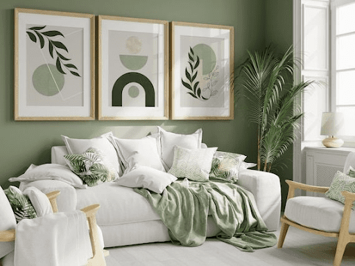
Soft Sage and Muted Botanical Shades
Sage remains a favorite for 2026 because it's calming, natural, and easy to live with. It's softer than forest green, so it works in more rooms—kitchens, breakfast nooks, laundry rooms, and bedrooms.
Sage pairs beautifully with light wood cabinetry, quartz surfaces, and warm neutrals. If you're refreshing utility spaces, sage looks great with storage upgrades .
The most livable sage tones have a gray base rather than a yellow one—they stay soft and muted across different lighting conditions rather than reading as olive or lime as the day shifts.
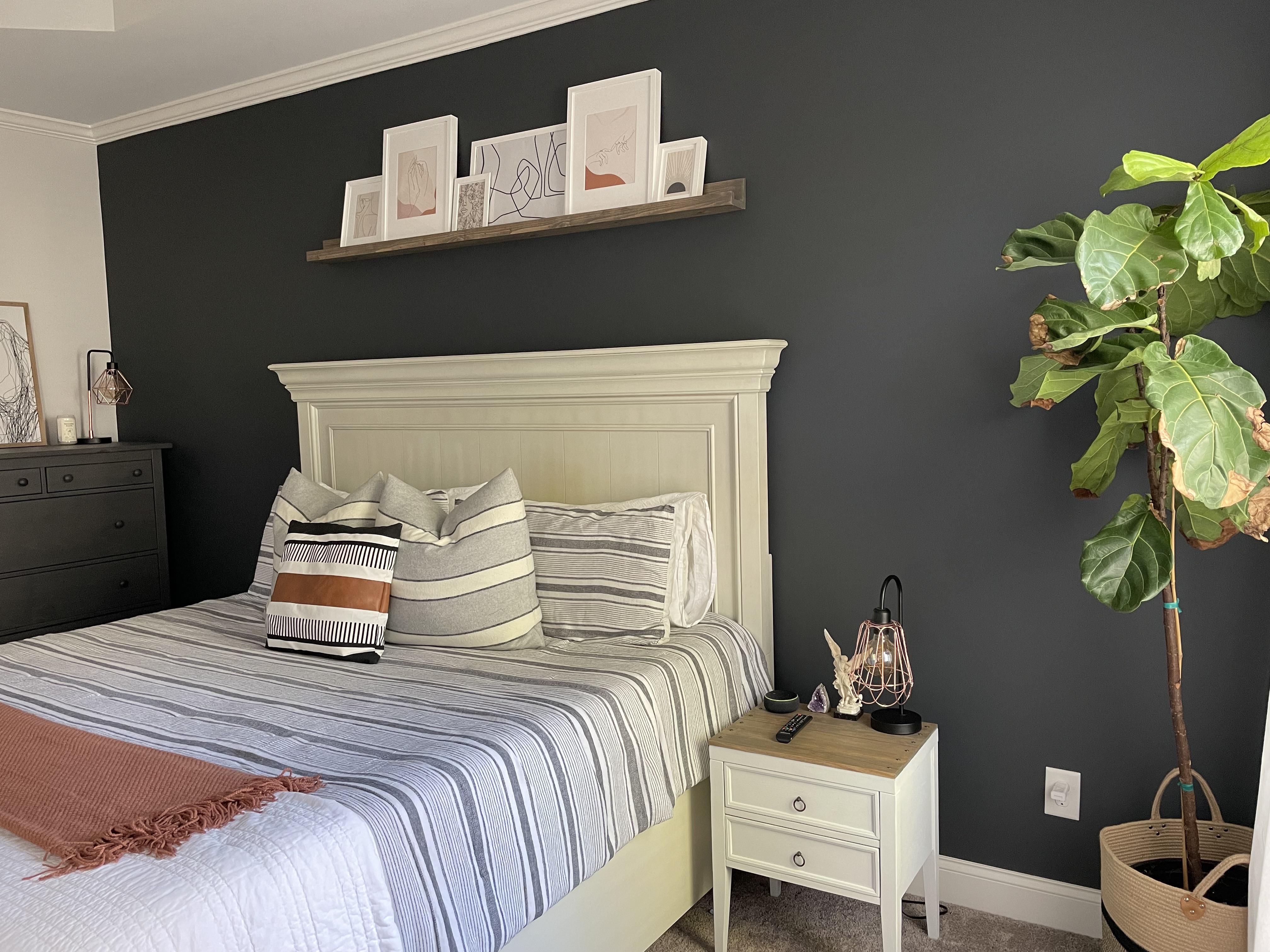
Dark Charcoal for Modern Contrast
Charcoal feature walls and darker built-in backdrops are a strong trend for homeowners who want contrast without going fully black. In rooms with big windows, charcoal adds drama while still feeling balanced.
Charcoal is also a smart color for TV walls, media rooms, and statement built-ins because it reduces screen glare and makes trim details pop (related read: custom entertainment centers & media walls).
If you're integrating paint with carpentry, lighting, or layout tweaks, it helps to work with experienced remodeling contractors in The Woodlands, Texas so the finish work looks crisp and premium.
Application tip: Charcoal reads differently on different surfaces—flat/matte finishes absorb light and feel moody; eggshell adds just enough sheen to prevent the color from feeling flat in a large room. Avoid satin on charcoal walls as it tends to highlight surface imperfections under direct lighting.
Soft Blue-Grays Inspired by Water and Sky
Blue-grays remain popular because they feel clean, calm, and spa-like—especially in bedrooms and bathrooms. The key is choosing a blue-gray that doesn't turn icy in shaded natural light.
Pairing tip: Blue-grays look best with warm whites, brushed metals, and natural wood accents—not stark chrome and bright white, which can make the combination feel clinical rather than serene.
If your home has limited daylight in certain areas, choose a lighter LRV (Light Reflectance Value) and prioritize a layered lighting plan (related read: maximizing natural light remodeling tips).
Blue-gray is one of the most forgiving colors in bathrooms because it works with chrome, nickel, and brass fixtures—and it makes white fixtures (tubs, sinks) look clean and bright by contrast.
Room-by-Room Color Guide
Color that works beautifully in a living room can feel wrong in a bedroom—and vice versa. Here's a practical breakdown of which 2026 color directions work best in each room type for Woodlands homes:
Living Room
Forest greens, warm taupes, and greige neutrals dominate here. The living room is where you want a color that looks good in daylight and under evening lighting, works with multiple furniture styles, and holds up over time. Avoid anything too trendy or highly saturated—these are the colors you'll want to live with for years.
Kitchen
Sage, warm white, and soft oatmeal tones are the strongest kitchen choices for 2026. Kitchens benefit from lighter LRV values because the space tends to have cabinetry, appliances, and countertops competing for visual attention—the walls should support, not compete. If you're also updating cabinetry, coordinate your wall color selection with your cabinet finish early in the process. See: best custom kitchen cabinet makers in The Woodlands.
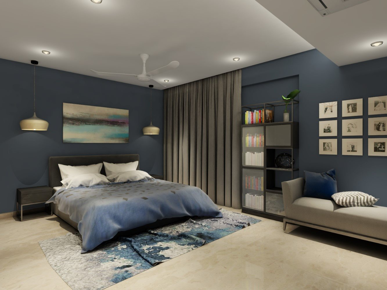
Primary Bedroom
Blue-gray, stone gray, warm taupe, and soft sage all work exceptionally well. The bedroom is where calming, lower-saturation colors shine—you want the room to feel like a retreat, not a showpiece. Slightly deeper versions of these colors (one shade richer than you'd use in a living room) add coziness without making the room feel small.
Home Office
Forest green and charcoal are the most popular choices for home offices in The Woodlands. Both create a focused, contained atmosphere that helps with concentration. If your office has good natural light, either works well. In a darker office, choose forest green with a gray base rather than a deep black-green—it will still feel intentional without absorbing all available light.
Bathrooms
Blue-gray, terracotta, sage, and warm white are all strong choices. In a primary bathroom, you have more flexibility for bolder choices (terracotta, forest green, charcoal on an accent wall). In smaller guest bathrooms, stay lighter—oatmeal or soft sage keeps the space feeling open. Always test your color under your actual bathroom lighting, which is often very different from the rest of the house.
Dining Room
The dining room is the one space where a richer, more dramatic color is consistently well-received—deep forest green, terracotta, or even a warm charcoal. These colors create an intimate atmosphere for evening meals and look striking against warm lighting, white trim, and a statement light fixture overhead.
How to Choose the Right Undertone
Undertone is the most important—and most overlooked—element of paint selection. Two colors that look similar on a chip can look completely different on a wall once their undertones react with the room's light, flooring, and fixed finishes.
- Check your fixed finishes first. Your flooring, cabinetry, countertops, and tile all have undertones. Identify whether they lean warm (yellow, red, orange base) or cool (blue, green, purple base). Your wall color's undertone should generally align with or intentionally contrast these—but mixing warm walls with cool fixed finishes (or vice versa) without understanding what you're doing is the most common source of "something feels off" results.
- Test against a white card, not the wall. Holding a chip against your painted wall compares it to the existing color, not to white. Compare swatches against a pure white card first to reveal the true undertone before testing on the wall.
- View samples in daylight AND at night. The undertone can shift dramatically between natural and artificial lighting. A taupe with a pink undertone may look perfect at noon and feel slightly rosy by evening under warm bulbs—or vice versa.
- In The Woodlands specifically: Favor warm undertones (yellow, beige, red) in colors you'd normally worry about being "too safe." The filtered light will naturally cool them down slightly, producing a more balanced result than you'd get in a home with full sun exposure.
Choosing the Right Paint Finish
Color gets most of the attention, but finish affects how a color actually looks on the wall—and how long it stays looking good. Here's a practical guide for Woodlands homes:
- Flat / Matte: Best for ceilings and low-traffic adult spaces (formal dining rooms, primary bedrooms). Absorbs light, hides wall imperfections, produces a sophisticated appearance—but marks easily and is harder to clean. Not recommended in kitchens, bathrooms, or kids' rooms.
- Eggshell: The most versatile finish for main living areas and bedrooms. Slight sheen, more durable than flat, easier to wipe clean. A good default for living rooms, hallways, and home offices.
- Satin: More sheen than eggshell, noticeably more washable. Best for kitchens, family rooms, laundry rooms, and kids' bedrooms. Note: higher sheen reveals surface imperfections more—walls need to be in good condition before applying satin.
- Semi-gloss: Used on trim, doors, and window frames. Creates contrast between walls and woodwork that reads as clean and intentional. Also appropriate for bathroom walls in high-moisture areas.
- High-gloss: Reserved for doors, cabinetry, and accents. Creates a lacquer-like appearance that's dramatic and durable—but very unforgiving of surface imperfections.
For most Woodlands home interiors: eggshell on walls, satin in kitchens and bathrooms, semi-gloss on all trim. This combination is durable, easy to clean, and looks consistently refined across different color choices.
When choosing any finish, look for low-VOC products—especially if you're painting multiple rooms or if the home will be occupied during the process. For guidance on VOCs and indoor air quality: EPA guidance on VOCs and indoor air quality.
Final Thoughts
The best interior paint colors for 2026 in The Woodlands all share one thing: they feel natural in real light. Whether you choose forest green, soft sage, warm taupe, oatmeal neutrals, or a refined stone gray, your final choice should work with your home's orientation, trim color, flooring, and fixed finishes cabinets, counters, tile.
Color selection is a design decision, but it's also a practical one. Test large swatches. Observe them at different times of day. Consider how the undertone reacts to your specific room's light and existing finishes. And choose a finish that will hold up to how the room is actually used.
If you're planning more than just paint like trim changes, feature walls, cabinetry, or a room-by-room refresh our team can help you coordinate a cohesive look through interior remodeling services in The Woodlands.
If you're choosing a remodeling contractor in The Woodlands for planning, reach out to trusted home remodeling & renovation contractors in The Woodlands
Choosing the right contractor matters. Reach out to Remodeling contractors The Woodlands & nearby areas like Spring, Conroe, Tomball, and Magnolia.